Kyle Barber
Associate Creative Director
Brands are always evolving—and Pliancy is no stranger to reinvention. We look back on our brand update, six months later.

Kyle Barber
Associate Creative Director
If I asked you to dress exclusively in your wardrobe from 10 years ago, how would you feel? Would the clothes fit you well? Would they match your current style, size, habits, or environment? Would they make you feel your best?
Like the clothes we wear, brands are a reflection of identity. They are always evolving—and Pliancy is no stranger to reinvention.
We got our start in 2008 as TSG, an accurate but plain initialism that stood for “Technology Strategy Group.” In 2017, we underwent a full rebrand to Pliancy, with an aesthetic and verbal identity that more clearly reflected our relationship-focused, tech-forward approach to IT. In June 2023, we brought our third iteration to life with a redesigned website, expanded palette, updated logo, and more.
From an outside perspective, a new website and a brand refresh can seem like a single event: one day, and everything changes. In reality, it’s a months-long process that both starts long before and extends far beyond launch day.
“Is rebranding really necessary?” you might ask. A brand is a point-in-time expression of a business: its philosophy, its history, its trajectory, and more. Some of those facets will stay the same; many of them will change over time.
Compared to 2017, Pliancy is a drastically different company. Our headcount has increased by leaps and bounds, our service offerings have expanded, and we now serve clients across the country. We were also operating in a rapidly changing IT landscape. Five or ten years ago, just having a cool brand presence was enough to set you apart, but we needed something more. It was time for our branding to reflect the size, scope, and capabilities of Pliancy as it exists today.
We didn’t wake up one morning and throw everything out the window, of course. Like any major project, we began with an internal audit. I interviewed key stakeholders to get their insights on how our brand impacted their roles and professional relationships—but I also met with anyone else who would volunteer, no matter where their position or tenure. If we claim to be a people-centric organization, then that has to be the bedrock of everything we do. An expression of our company’s identity can’t be driven solely by leadership alone. It belongs to all of us.
Conversations with colleagues from all corners of the company gave me a full-spectrum understanding of how people saw our brand, their favorite and least favorite elements, content wishlists, and other observations. Everyone had drastically different ideas of what our refreshed brand and website should encompass, shaped by their individual responsibilities and relationships.
I ended up with multiple massive spreadsheets of comments describing what people wanted the brand to be or do. We couldn’t implement everything (and not just because some opinions were completely at odds with others), but that feedback shaped the first iteration of the website’s new architecture. It directed our conversations about what we needed the updated branding to accomplish and helped us keep all perspectives in mind.
To design our next evolution, we partnered with Overline, who has walked with us through many phases of Pliancy from our early growth to now. (Read more about our collaboration.)
An early and obvious goal was to maintain continuity with our existing elements and language. We didn’t want to abandon everything that had gotten us to where we were. Not only would that alienate clients and colleagues, but it would also render our old assets completely useless.
Digital assets tend to persevere—for better or for worse. We wanted to make sure that if you saw an old Pliancy deck from four years ago, it would still be recognizable as the same brand.

We call our logo the Occam, a tribute to Occam’s razor, to represent our pursuit of the simplest, most elegant solutions. That concept is a core part of Pliancy’s DNA, therefore we knew the idea of the Occam wouldn’t change, nor would we depart from our signature purple.
To reflect our relentless pursuit of less—less complexity, less obfuscation—we eliminated the border around our mark for a cleaner aesthetic and a more powerful impact at small sizes. Like the next evolution of Pliancy, the new Occam is free and unbounded, embodying the dynamism of our future trajectory. We also enriched the purple color to make it more dynamic, a change we carried throughout our expanded, updated palette.
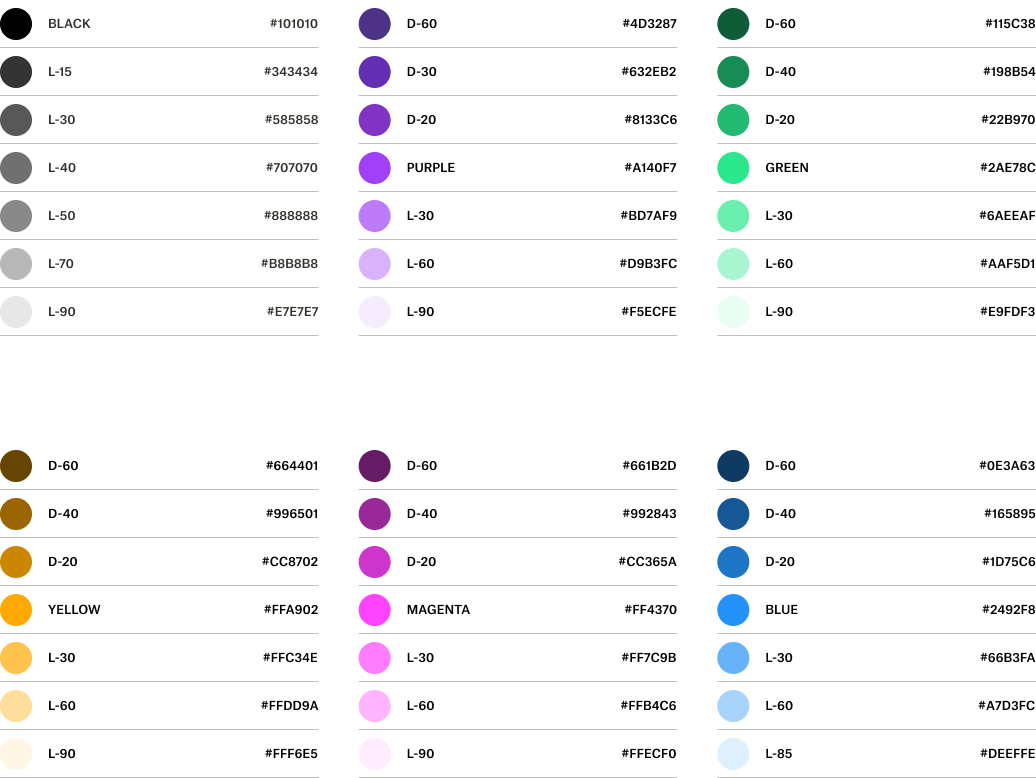
This was a step-up evolution, not a drastic change. We weren’t trying to change the direction of the company or distance ourselves from an earlier version of Pliancy. Our brand evolution simply needed to match the evolution of our business. In tandem, our website needed to move from ambiguity to clarity.
It has been years since we were a Palo Alto-based company with a single-digit headcount. But if you visited our website in May 2023 and were greeted with a photo of the Golden Gate Bridge—one that hadn’t changed since 2017—you might think we serve Bay Area clients only. At the same time, the language around our services was cryptic and obfuscated what clients could expect day-to-day.
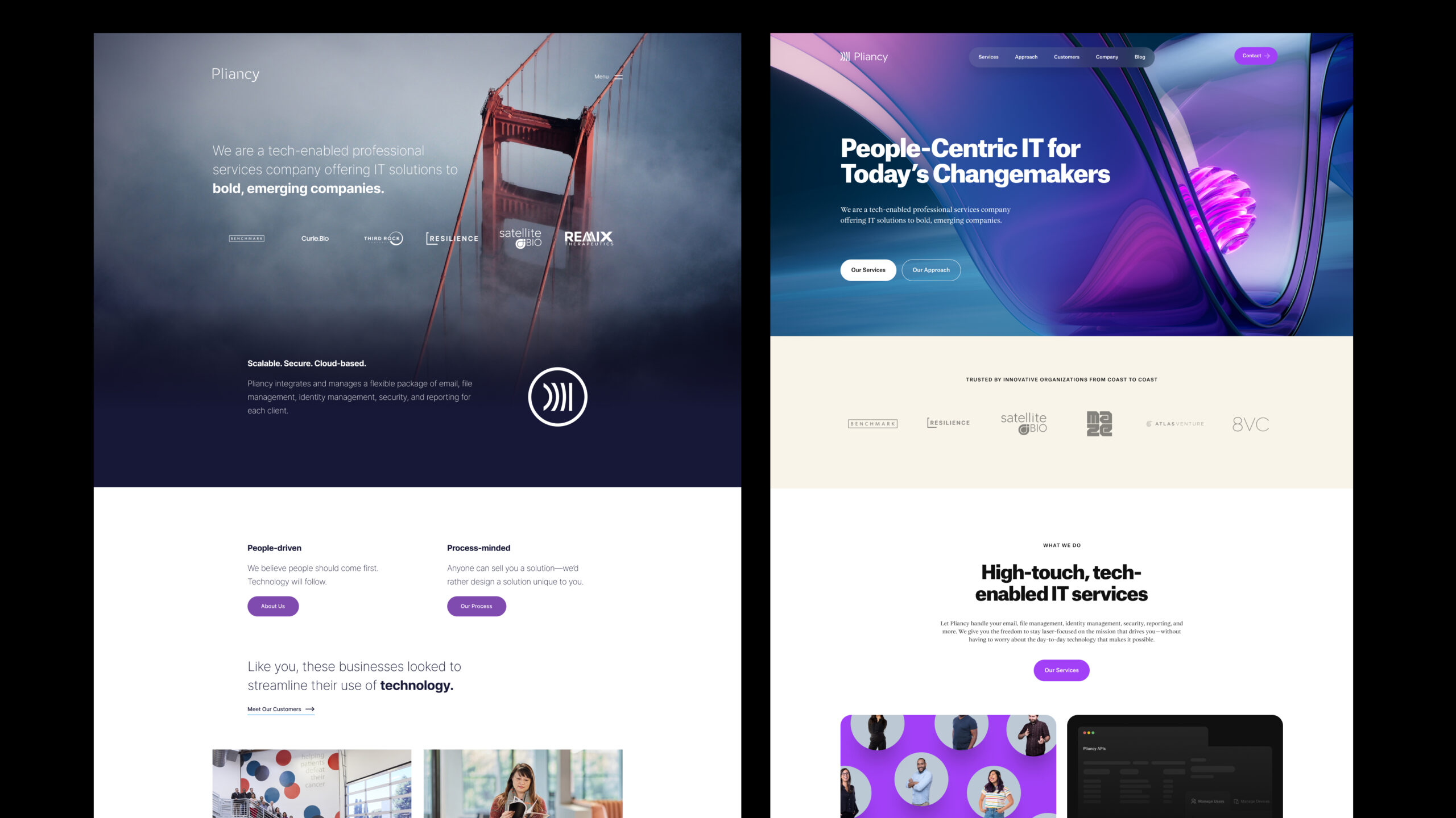
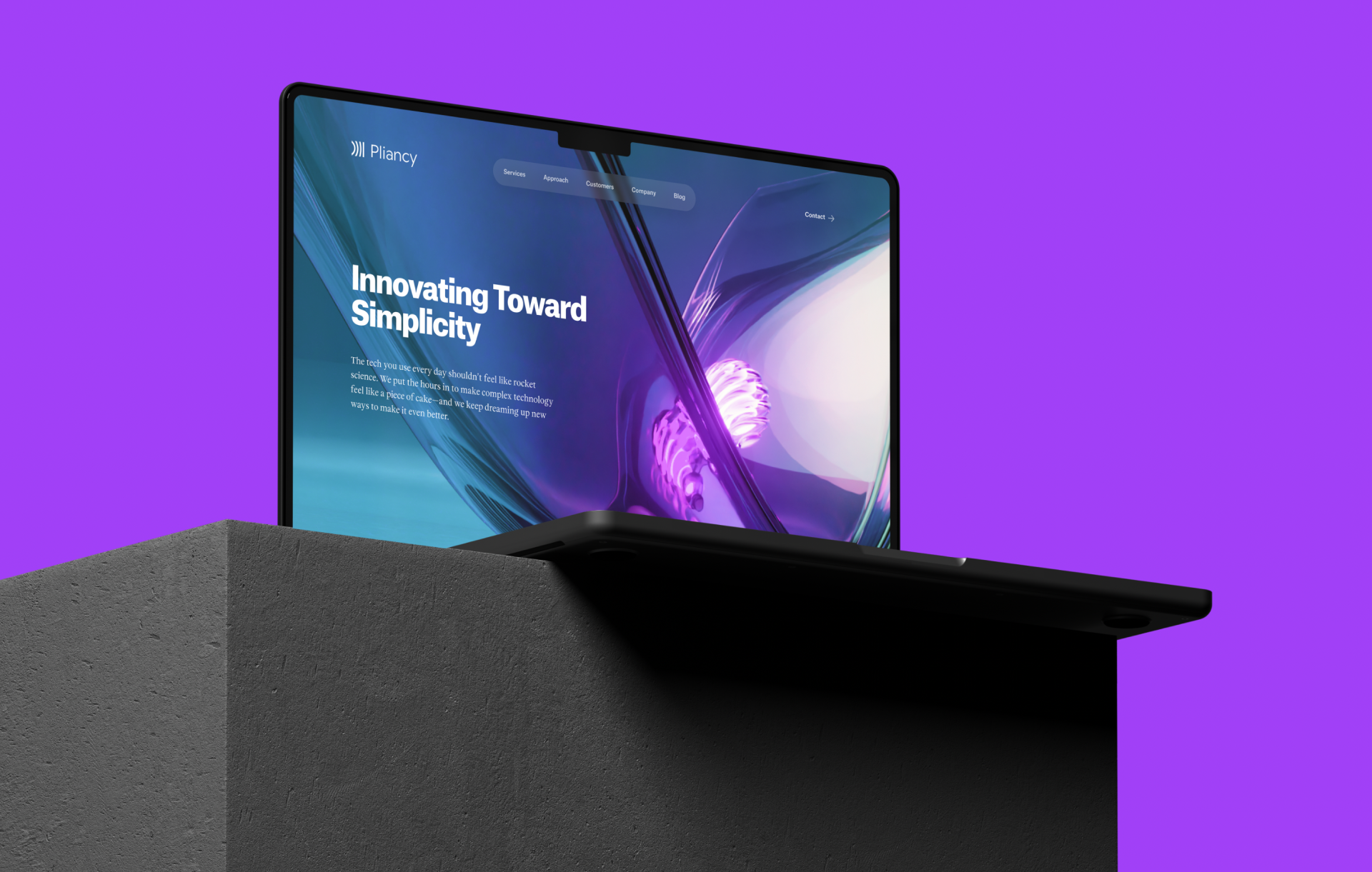
Pliancy now has six offices in four states, serving clients from coast to coast. To unhook ourselves geographically, we introduced intricate 3D renderings from artist Bryan Barger, adding dimension, motion, and wonder to our assets without referencing specific regions.

These striking visuals encapsulate the transformative magic of Pliancy’s tech-enabled professional services. We highlight transparency with glass & light textures; automation and iteration with repeated movement; and knowledge with an internally lit core to represent the way that our knowledge powers everything we do. Paired with transparent explanations of our services and approach, the new site and related assets now possess a more straightforward expression of Pliancy’s offerings and ethos.
Any brand adjustment, whether it’s a full identity change or a refresh, has three phases: planning, design, and rollout. Our third phase began with our website launch, the biggest (and most public) part of the rebrand—but that was only the beginning.
Our initial audit outlined a list of about 20 assets that would need to be updated: email signatures, deck templates, social media, the usual. While we knew the list wouldn’t be exhaustive, we thought we’d be close. In practice, the real scope dwarfed our initial list.
Think about all the places your logo appears: throughout your intranet, in your HRIS platform, as part of your Slack theme, on your two-factor authentication screens, in your training modules, on company Zoom backgrounds… Six months later, we’re still finding places to update.
Why do small updates matter? If updating a brand is updating your wardrobe, these details are akin to your accessories. Belts, socks, hats, bags, pins, and patches—these are the difference between wearing an outfit and styling one. It may feel like an endless (and thankless) task, but every instance contributes to brand cohesiveness and brand strength.
The silver lining to making a million minor updates: it’s a team effort. We didn’t have to hunt down every instance for ourselves; in many cases, it came to us. In the course of their work, colleagues across the org found things we’d missed and made the effort to flag them, reflecting the signature Pliancy drive to make things better, in ways large and small.
Pliancy is unique in the way that everyone (or almost everyone) actually cares about or has interest in our brand. Everyone knows that we use it to put our best foot forward from the beginning. It’s a big part of our culture. We don’t send out messy pitches or ugly proposals. We don’t just plaster our logo on a 5¢ ballpoint pen and call it swag. When it comes to brand, we don’t phone it in.
Your company might also have an environment where brand resonates—or maybe not. If you’re finding it’s an uphill battle, here are a few strategies that work for Pliancy.
To maximize buy-in and familiarity, branding should be part of the conversation from the start. During their first two weeks, new Pliancy employees attend multiple onboarding meetings to teach them about the company. We dedicate an entire meeting to our brand history, its role, and why it’s important, sharing our thought process and intent.
Employees should be able to recognize their company’s branding immediately. To do that, they need to see it consistently. We brand as much employee communication as possible: all hands meetings, slide decks, internal event flyers, employee handbooks—just to name a few. It’s not a low-lift endeavor, but it’s an investment we make in order to equip team members to act as brand stewards. If they can identify our brand right away, it means they’re more likely to notice when something is off-brand.
For the group in charge of branding—whether that’s your Creative department, your Design squad, your Communications team, or your Marketing arm—no task should be too small. As the primary person responsible for visual branding updates, I’m not above any little thing. If I have to sit and swap logos in 50 different places, I consider that a good use of my time. I want to show my colleagues that branding work matters to me. And not only does it matter to me, but it matters so much to me that I want it to matter to them, too.
At Pliancy, branding is about more than just looking good (though we like when things look good, too). It’s a way for us to express who we are, how we work, and what we value.
We know this won’t be the last iteration of Pliancy. Change is the only constant, after all. So no matter how we change, we’ll be prepared to meet our future selves wherever we’ll be: with a new shape, a new size, a new color—whatever we need.

Get updates from Pliancy delivered straight to your inbox
We’ve got the lowdown on due diligence questionnaires. With this explainer in your back pocket, you’ll be able to tackle DDQs with confidence.

Noah Tagliaferri
VP of Growth

Onboarding can be a nightmare for employees. It doesn’t have to be—if you remember who you’re building for.

Tiffany Kress
Head of People

Brands are always evolving, and Pliancy is no stranger to reinvention. We look back on our brand update, six months later.

Kyle Barber
Associate Creative Director


711 Boylston St, 6th Floor
Boston, MA 02116
415 Grand Ave, Suite 105
South San Francisco, CA 94080
265 Canal St, Suite 505
New York, NY 10013
2450 Colorado Ave, Ste 229-230
Santa Monica, CA 90404
1012 Rio Grande St,
Austin, TX 78701
9820 Willow Creek Rd Suite 450
San Diego, CA 92131